ShopDreamUp AI ArtDreamUp
Deviation Actions


Suggested Deviants


Suggested Collections


You Might Like…


Featured in Groups


Description
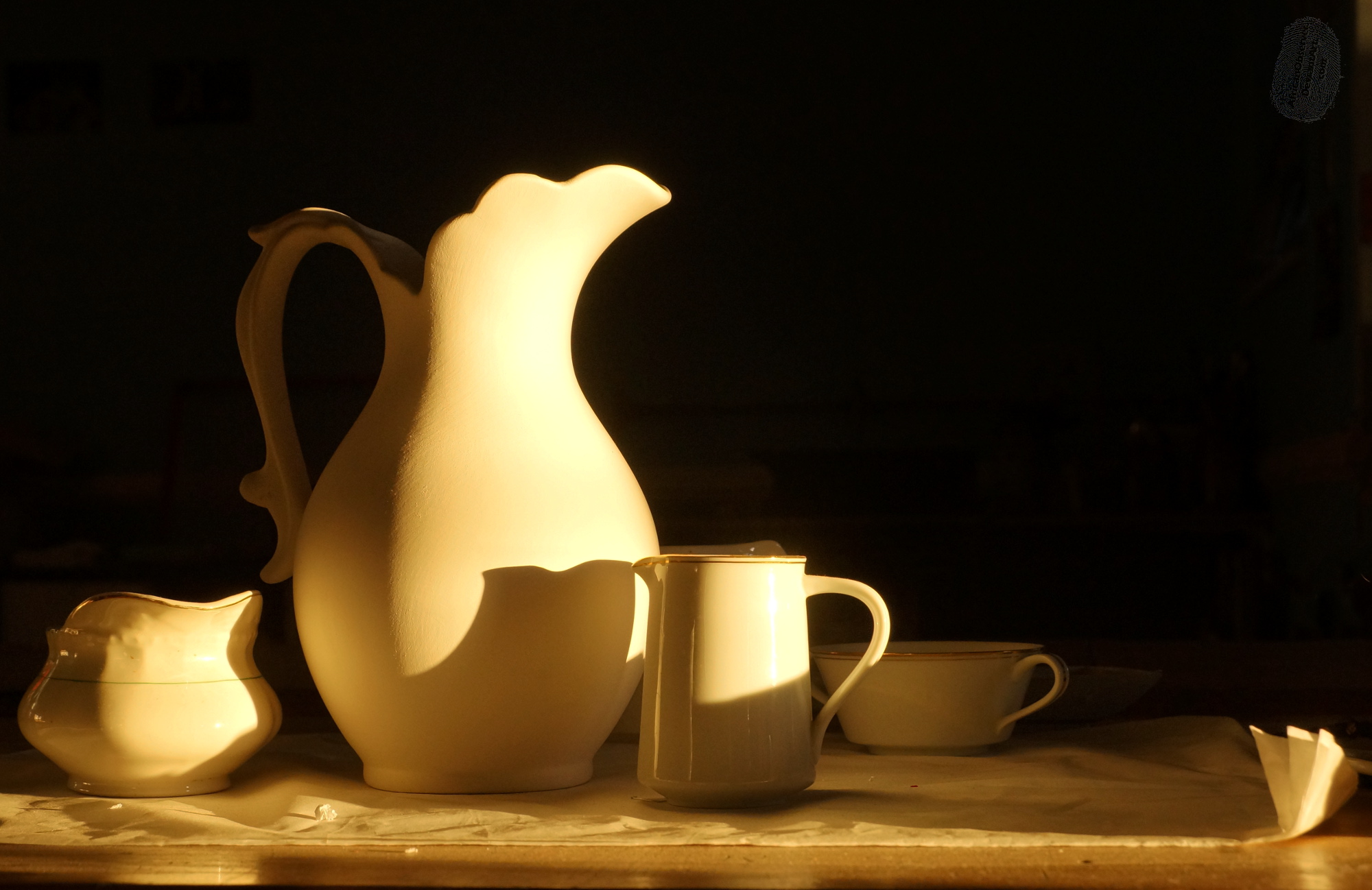
The art teacher had set these out for an exam, and I went past to say good morning, just as the sun was rising. (It does that rather late in Cape Town, for geopolitical reasons)
So it's still a 'found' image, rather than my own still life. Although I did make some small changes.
------
Comments from elsewhere, so that I can see them all in one place, and think about them all together!
Thanks for the feedback - I thought the hint of background gave it some context, a sense of 'being somewhere' rather than a floating abstraction. Maybe I must have another look, or even reshoot if I get a chance.
So it's still a 'found' image, rather than my own still life. Although I did make some small changes.
------
Comments from elsewhere, so that I can see them all in one place, and think about them all together!
As I noticed one of your comments states, I liked it better as a thumbnail. While the warm morning light does cast on the pitcher and cups very nicely, I cant help but be a bit distracted from them by the cluttered background. Perhaps if that had taken less of the light and been blackened out it would keep the attention on the intended subject better.
THAT BEING SAID
I dont think its a bad photograph, just being nitpicky for the critique.
THAT BEING SAID
I dont think its a bad photograph, just being nitpicky for the critique.
Thanks for the feedback - I thought the hint of background gave it some context, a sense of 'being somewhere' rather than a floating abstraction. Maybe I must have another look, or even reshoot if I get a chance.
just crop off that turned up cloth on the right hand side and look at it again.
Personally, I like it. I think that slightly tighter crop would improve the whole composition. While the lack of detail on the tall jug surprised me, it gives a lovely abstract shape as the main feature - then little things like that fluttering cloth and the apparent dent on the left piece draw the eye away.
Personally, I like it. I think that slightly tighter crop would improve the whole composition. While the lack of detail on the tall jug surprised me, it gives a lovely abstract shape as the main feature - then little things like that fluttering cloth and the apparent dent on the left piece draw the eye away.
Hi Layne (?)
Thanks for the feedback - and sorry for the delay in getting back to you. I think I pulled the image into GIMP again to try it, and then ended up side-tracked!
I think 'draw the eye away' is at the heart of this - there is no strong 'organising idea' in this to really hold it together. There are many interesting parts - different folks pick up on different 'distractions' (lurking background objects, texture differences, that flap of paper, etc) - but the big jug, which should be the anchor, isn't quite strong enough to hold it together.
Good grist for the analytical mill here.
Image size
2000x1298px 507.82 KB
Make
SONY
Model
SLT-A57
Shutter Speed
1/250 second
Aperture
F/8.0
Focal Length
40 mm
ISO Speed
800
Date Taken
May 26, 2016, 7:42:03 AM
Comments18
Join the community to add your comment. Already a deviant? Log In
Lets start off with what I think you got right:
The strong side lighting really works for this image, not only does it cast interesting shadows on the pitcher, but causes interesting shadows to give the cloth more texture. I feel that if the light had been more top heavy the cloth would have looked more smooth and just "blah". The highlights are well done, and not overly blown out, which can be very tricky with many white / cream colored subjects in this strong of light.
Now, the picky parts:
Compositionally it is interesting, but could be improved upon. I like the angle you used, it lends some depth to the photograph since you can see pieces are moved forward and backward in the frame.
That said the sugar bowl is too far back, it has no direct light on it at all, which makes it look like it was not supposed to be part of the photo.
Whatever is behind the pitcher and cup is distracting as well, especially with the single point of bright light reflection on the rim.
Someone said to crop out the cloth folds on the bottom right of the frame, I don't agree with them. I feel like it gives some lightness to a pretty "heavy" image. I feel that if it was just the ceramic in the still life it would be fairly dull, even with the dramatic shadows. The upturned corners add just the smallest amount of realism to the set, since real life isn't perfect either. Without the little imperfection it would look too perfect, like a digital rendering.
The most glaring thing though is that the pitcher does not belong with the set. It appears to be un-glazed while the rest of the items are glazed. It is also missing the gold trim that the rest of the items have on the rims. It takes a second to figure out what just looks "off" in the image, but once you find it it cannot be unseen. Sometimes different textures can work in an image, but in this particular one it does not.
For a "found" still life image it is pretty good. If it was a still life that you had put together yourself, I would definitely recommend keeping an eye on the composition and texture things that I pointed out.
Keep up the good work!